Mapping New England: Income Distribution by County 
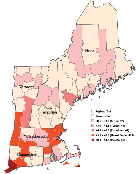
Franklin County, Vermont, has the smallest gap between low-income and high-income residents. Nantucket County, Massachusetts, has the biggest gap. Check the map for your county.


The Gini score has been used to measure income dispersion for a century. A Gini score of one signifies that one household received 100 percent of the income in a region; zero signifies perfect equality of income distribution. The most recent U.S. score was 46.8. This is more uneven income distribution than Europe, where most countries score between 25 and 35, and similar to Argentina or El Salvador, which score 46 and 47 respectively.
In New England, 62 of the 67 counties score below the United States average (signaling more-equal income dispersion). The region's population-weighted average is 45.2. The county scores range from a low of 38.2 (more equal incomes) to a high of 54.7 (most widely disparate incomes). In Franklin County, Vermont (Gini score of 38.2), the top 5 percent of households receive 16.6 percent of the aggregate income. In Nantucket County, Massachusetts (Gini score of 54.7), the top 5 percent receive 34 percent of the aggregate income.
Source: 2006-2010 American Community Survey, prepared by the U.S. Census Bureau, 2011. World Development Indicators, The World Bank 2012.
Articles may be reprinted if Communities & Banking and the author are credited and the following disclaimer is used: "The views expressed are not necessarily those of the Federal Reserve Bank of Boston or the Federal Reserve System. Information about organizations and upcoming events is strictly informational and not an endorsement."

 About the Authors
Kaili Mauricio